Text is an integral part of UI design and user experience. High-quality, usability-focused copy helps engage users and turn them into customers.
User experience (UX) writing is much more than a buzzword. It combines writing proficiency and inventiveness with a strong focus on user actions. The goal is to make things smooth, easy, and informative (and amusing when suitable) for the person on the other side of the screen.
UX writing may seem easy on the surface, but it takes wit and practice to deliver a good copy that navigates users through an application or website. Successful UX text simplifies the user journey by clarifying button actions, guiding users through forms, and offering them friendly nudges when things go awry. Overall, it is a vital part of the entire user experience.
There’s more. Well-conceived UX writing goes beyond the practicalities and establishes a consistent brand voice, builds trust, and transforms a potentially confusing environment of a digital product into a friendly space where users want to return.
Considering the above, it won’t be an overstatement to claim that UX text contributes to digital products’ success – using user attraction and retention.
But before you shoot off to hunt for a UX writer with the best UX writing portfolio on the planet, let’s explore the details of the process.
What are the types of UX writing?
UX texts come in many forms and varieties, but there are several distinct categories into which most user-experience copywriting falls. Here’s a rough classification of UX writing types.
Microcopy
Frequently confused with UX writing, microcopy is a concise text used in interfaces to guide users and provide instructions or feedback. You can think of it as UI writing encompassing most other UX copywriting categories. So, why not identify the two? Primarily because UX writing refers to the bigger picture of designing customer-facing communication rather than writing any microcontent for web pages.
Navigation text
Clear and descriptive text that aids users in navigating through a website or application. Examples include menu labels, links, and basic contact information.
Onboarding copy
A piece of writing, such as a welcome message, an offer overview, or an introductory tutorial, that helps users navigate and understand a product during the initial setup or after loading a page.
Call-to-action (CTA)
Clear, compelling, and action-oriented copy that prompts users to take specific actions, such as “Sign Up,” “Buy Now,” or “Subscribe.”
Promotional copy
Text used for marketing messages, promotional banners, and other content intended to encourage users to explore additional features or offerings.
Error messages
They inform users about issues, errors, or unsuccessful actions. Well-crafted error messages provide tips on how to resolve the problem.
Confirmation messages
They confirm the successful completion of an action or transaction. Positive language and reassuring tone are crucial for this type of copy.
Form field labels and instructions
Clear and helpful text that guides users when filling out forms, ensuring a smooth and error-free interaction.
Button labels
Micro-microcopy applied to interactive elements. They guide users to take specific actions within a digital interface, e.g., “Cancel,” “Continue,” or “Submit.”
Notifications and alerts
Messages that inform users about system updates, changes, or important events. They should be timely and informative.
Other types of UX copywriting include chatbot scripts for virtual assistants, accessibility texts supporting users with disabilities, help documentation such as tooltips and FAQs, and may even extend to legal content, such as terms of service, privacy policies, or compliance-related information.
Examples of good UX writing with key guidelines
There are tons of examples of UX copywriting craftsmanship online.
Typically, you can find them on the websites (or in apps, for that matter) of well-established brands that appreciate the role of UX design, create detailed customer journey maps, and can afford a seasoned UX writer to tailor the best communication style.
Let’s not stereotype, though: frequently, small brands deliver top-notch quality, while it’s not uncommon for big companies to bungle the job.
Here, we focus only on state-of-the-art UX writing examples. Each of them illustrates at least one key recommendation for flawless UX writing – even though each one is exemplary in several regards.
So, here we go!
Emphasize clarity
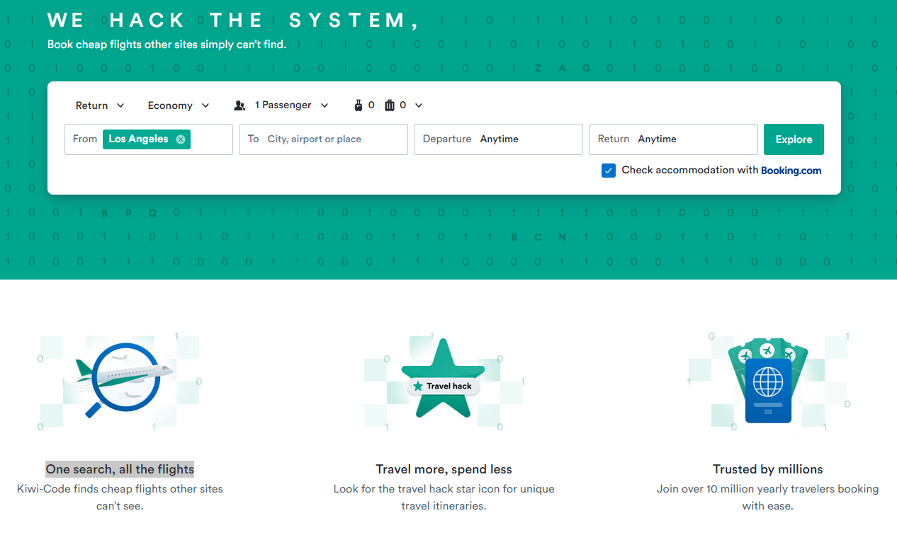
Here’s a stellar example of copy to have in a UX writing portfolio. In case you haven’t visited Kiwi’s website recently, the full animated tagline goes “We hack the system, you fly for less” – brilliant in conveying the essence of the service with brevity and a rebellious touch.
You can find more excellence below in communicating the value proposition. Kiwi explains in plain and simple English how its service benefits users, addressing common concerns like convenience (“One search, all the flights”) and economy (“spend less”) and promising more of the good stuff (“Travel more”). Both lines, meaningful and snappy, are followed by explanatory notes providing additional explanation.
The third element in the row serves as a form of social proof informing that the service has a large and satisfied user base, which instills trust in new users and assures them of Kiwi’s reliability.

Keep it simple and instructive

This one is more modest stylistically but spot-on in terms of simplicity and instructiveness. This Code Academy’s mobile app screen clarifies how to choose between two options in a flashcard review in an online course.
Note the use of icons, which increases clarity and leaves no space for ambiguity. The tips are followed by a short explanation of the mechanics behind the review, anticipating any doubts users may have.
Avoiding complex content and keeping communication simple and instructive is the foundational principle of effective UX writing. Users appreciate information distilled into clear, straightforward language that smoothly guides them through the interface.
Be human (even if you’re a bot)

UX copywriting is not about cracking jokes, but if you’re overdoing it on a professional language, you might scare off a user or two (depending on your business’s profile). Balancing correctness and a human touch in UX text is a delicate art. It involves crafting clear and concise messages that radiate a sense of warmth and relatability and maintaining a conversational tone when possible.
Remember to do it within reasonable limits. The key lies in maintaining a tone that aligns with the brand’s identity and industry standards while acknowledging your end users’ sensitivity and needs.
The screen below, taken from the Slack mobile app, contains an exemplary piece of a chatbot script. The copy is engaging and a bit charming in its subtle sense of humor combined with friendly, non-pushy enthusiasm directed toward the user.
Pay attention to information architecture
It’s not only about how you write it – how you position the copy also matters. A flawless web page layout is imperative for every UX designer. UX writers should also acknowledge the significance of information architecture.
UX content creator’s role is to structure and organize text in a way that is logical, intuitive, and user-centric. Each piece of writing should be placed in a way that corresponds with a user’s journey through the website or an app and assists them in performing specific actions.
Check out this great example of UX text arrangement on Ahrefs.com website, starting with the navigation bar on top, through the right-to-the-point tagline communicating the core offer, the actionable CTA button, fine-print social-proof copy supported by brand logotypes, and moving on to one-line descriptions of key features of the service (note the imperative mood prompting users to take action).

Be sure to mention benefits

Users visit your website or download your app because they want something. Don’t make them struggle to find it. Clearly laid-out benefits are an important component of successful microcopy. UX writers should be able not only to navigate users through the ecosystem’s features but also explain how those features – and the overall service – directly benefit users.
User-centric language and focusing on the positive impact of a digital product ensures that users understand the value proposition and are encouraged to engage more deeply.
This well-structured piece of written content from Booking is a good example of benefit-focused UX writing. The header provides a general clue about the offer, while the microcopy below lays out the details. Then, there’s the CTA button prompting users to come on board, followed by a neat copy on the white background with a few words about the second aspect of the benefit (saving vs earning).
Overall, it’s a top-notch example of how to make onboarding successful with good UX writing focused on the value proposition.
The top 4 mistakes UX writers should avoid
Following UX copywriting good practices and avoiding common mistakes is crucial for the overall positive user experience. A copywriter who isn’t a senior UX writer with in-depth usability knowledge should closely collaborate with UX designers to be able to deliver effective copy aligned with the product’s functionality and the brand personality of the company. Making common mistakes can be pricey in terms of bounce rate and lost users. Here’s what UX writers should strongly avoid.
Lack of clarity
Unclear language may confuse readers. When those readers are your potential customers, you can’t afford ambiguity. Be straightforward and precise in your messaging, focus on providing information and prompting to action.
Too much fancy language
UX content is neither a column for a weekly nor a paper for domain experts. So, don’t try too hard with fancy words or jargon, and limit metaphor usage. Good UX copy feels natural, addresses potential concerns, and provides additional support for an end user.
Information overload
Nowadays, we’re being bombarded by information from all sorts of channels. Too long copy or too many details can scare off users instead of attracting their interest. Focus on providing guidance and communicating key components of your offer.
Inconsistent tone of voice
Brands should communicate with a consistent tone of voice. If your copy is not cohesive in tone and style, it may sound awkward and confusing, failing to win over users.
Could you use some good UX writing?
Creating impeccable UX content requires a cross-field collaboration involving the roles of a UX writer, content strategist, UX designer, and UI developer. In more ambitious projects, UX research and usability testing will add to the effect and help generate better results. If you think you could use some backup in the UX area, feel free to reach out!


